Building a design system at Grubhub
How a design system changed the business model

Once upon a time, there was a company in Boston called LevelUp — and before that SCVNGR. LevelUp built custom apps for restaurants that enabled a suite of functionality — including rewards campaigns, order ahead, loyalty and status campaigns, and more. Additionally, LevelUp had its own app that allowed users to gain points by making purchases at certain businesses, and redeem those points at those same businesses.
Grubhub acquired LevelUp for $390M in 2018 — and shortly thereafter, I was brought on board as the first product designer on this team, which would become known as the “Grubhub enterprise agency.”
Grubhub enterprise agency’s mission
We designed and built apps for restaurants that wanted custom solutions. Grubhub got to take advantage of some of LevelUp’s APIs, and the custom apps built on the agency team could now leverage certain elements of Grubhub (such as adding delivery via Grubhub couriers). There were definitely other important benefits to this acquisition, however, these were the fundamental goals as they impacted design.
The model
When I was brought on, I found that there was a base template that was used for most apps. When a client wanted a custom app, they could pick certain functionality they wanted to include, and then the visual design team would apply the brand’s style guide to the template (in Sketch at this point).
When new features were requested, or when existing features needed improving, they were often assigned to whichever visual designer had the bandwidth. Bringing me on allowed for the visual designers to focus on their work, and for me to take on the feature work.
At this point, there was no concept of a design system — however, there were symbols that were reused (remember we’re in Sketch at this point) and those symbols could be styled to more easily style the template.
However, due to the disjointed nature of product work, most features didn’t share a common set of symbols — and consistency was rare. Additionally, the more symbols that existed, the longer it took for apps to be styled, built, QA’d, and released.
The transition to Figma
At a certain point, we realized that Figma was going to be a more useful tool for us — of course, this required a good amount of work to move everything over. My coworker Lauren Andres and I led the charge by moving everything from Sketch to Figma and by defining how we would be using libraries, organizing files, and more.
Figma limitation note
Because of the nature of our product — we needed the ability for multiple designers to style components in different ways simultaneously. Because of how Figma worked at the time, a central library of components wouldn’t work, because each visual designer needed a local library of components per project.

For this reason, we had to make the design system and the template one file.


This file could then be duplicated by visual design to be styled for a client. This also acted effectively as a makeshift versioning tool. As components were updated, previously styled files wouldn’t get those updates, which kept us honest about the version of any existing app.
The downside was really in how annoying it was to update a previously styled app (although plugins now exist that would make this smoother).
The introduction of a design system
One of the more effective, albeit unscalable, methods of achieving consistency can be to have one designer designing everything. At this point, I was the only designer working on mobile (iOS and Android). Due to this, it was very easy for me to establish patterns and to design reusable components.
As the potential of these reusable components presented itself, engineering began to want an even more robust system of components — and I found myself in charge of creating a design system for our mobile product.
Product buy-in
Product buy-in was not easily achieved. The ROI on a design system starts off negative as simple tickets take an extra sprint because of the added complexity of building reusable components vs one-offs.
We decided to test the effectiveness of a design system by designing some simple screens and seeing if we could measure the benefits.
Table Row/1 ROI
For this test, I collaborated with Lauren Andres, a coworker who was responsible for the web product. She and I redesigned the mobile settings screen by designing a couple of basic table rows — as well as a header component (which was really just the native iOS and Android headers/top nav).
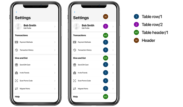
This simple design demonstrated the potential of component-based design. Eventually, Table Row/1went on to replace 11 existing table rows — as well as being used regularly in future features.
I calculated a rough ROI of Table Row/1 using IBM’s pattern efficiency model.
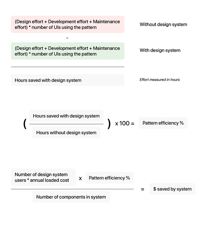
In our case:
(3+5+2)*11 = 110
(6+12+4)+((.1+.1)*11) = 24.2
110–24.2 = 85.8
(85.8/110)*100 = 78% pattern efficiency
4 designers and devs working with component * 150,000 annual loaded cost = $600k
$600k * .78 = $468000
$468,000/32 components in system = $14,625.00
Table Row/1saves an estimated $14,625.00
No equation can be perfect and many of these numbers are estimates, however, it is indisputable that this single component created value — and that it continues to whenever it is used in new designs.
Strategic rollout of system
The rollout of our design system (which we affectionately referred to as CBD [Component-based-design]) was extremely lean. We built components only as they were needed for features as opposed to building a foundational component library first.
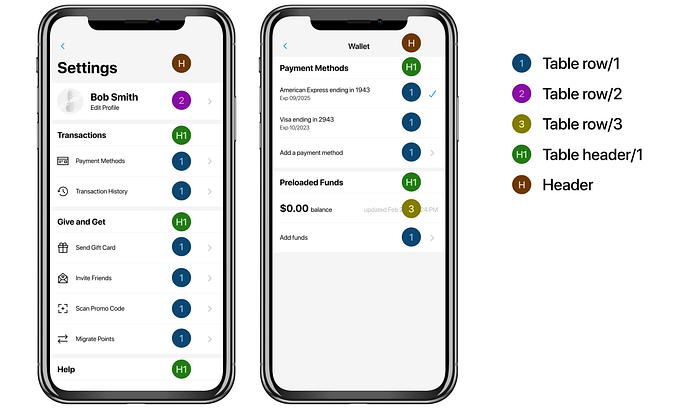
For example, Table Row/1 and Table Row/2 were built for Settings. The next feature I worked on was Payment Preferences in which we used both of those table rows but also needed to create Table Row/3 for a specific use case.
This sort of rollout has pros and cons. The most notable positive would be the complete avoidance of “waste.” Building a foundational library can result in certain components being built, only to discover later that they are rarely or never used.
The most notable negative was the decreased speed of feature work because every feature required at least one new reusable component.
How a design system can change a business direction
As our library of legacy symbols slowly shrunk into a smaller, more efficient, library of reusable components — the flexibility of styling decreased. This trade-off inspired a new business model. Traditionally we had allowed clients to make practically unlimited requests about how their app would look and work. As we made more deliberate decisions about the UX and UI of our template, it was decided that we should provide a tiered offering. And thus Grubhub Direct was born.
Grubhub direct
The idea behind Grubhub direct is simple — for a reasonable price, a restaurant can have an app that is styled with their colors, fonts, and images. However, they won’t have a say in how the app looks or works beyond certain basics.
This would open up a larger market of potential clients and decrease the time required to launch an app. Additionally, it would decrease the maintenance and documentation costs associated with a bunch of apps that all ran differently and were full of their own specific requests.
For clients with larger budgets, they’re able to pay more for more say in customization and functionality.
The impact
Above, I discussed the ROI of a single component — this ROI increases at the library of reusable components increases (as long as they are reused).
Additionally, the legacy app release time could take from 2–3 months in design and engineering time. With Grubhub Direct — it is possible to release an app in 1 day.
The design system was instrumental and allowing for this shift in the business model. From a design perspective, the only other factor that changed was a bigger focus on the template’s default UI (through my feature work).
Perhaps the best indicator of the impact is this quote from a Wadie Abbas, PM:
“The implementation of a component-based design system has improved development quality, app stability, and standardized the design language used throughout the application. Development burn-down and maintenance costs have also improved as a result.”
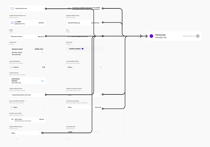
For a look into a sample of the design system, I created while at Grubhub, check out this Figma file.
